Highlighting the Immersive Experience of a Children's Museum
Redesigning Museo Pambata's website with an updated information architecture and design language to support its mission of shaping Filipino childhood.
What inspired this project was a memory from my childhood when our high school class was invited to paint a snakes-and-ladders game on the grounds of Museo Pambata. It was educational, a bit tiring, but ultimately fun.
As a UX designer now, and having worked with other organizations in culture and the arts, the logical next step was to check their website and see what it looked like.
Initial Thoughts
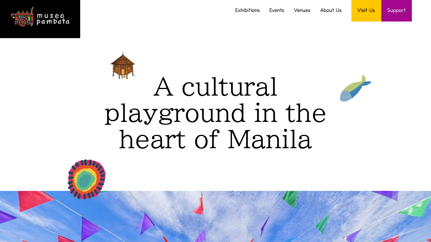
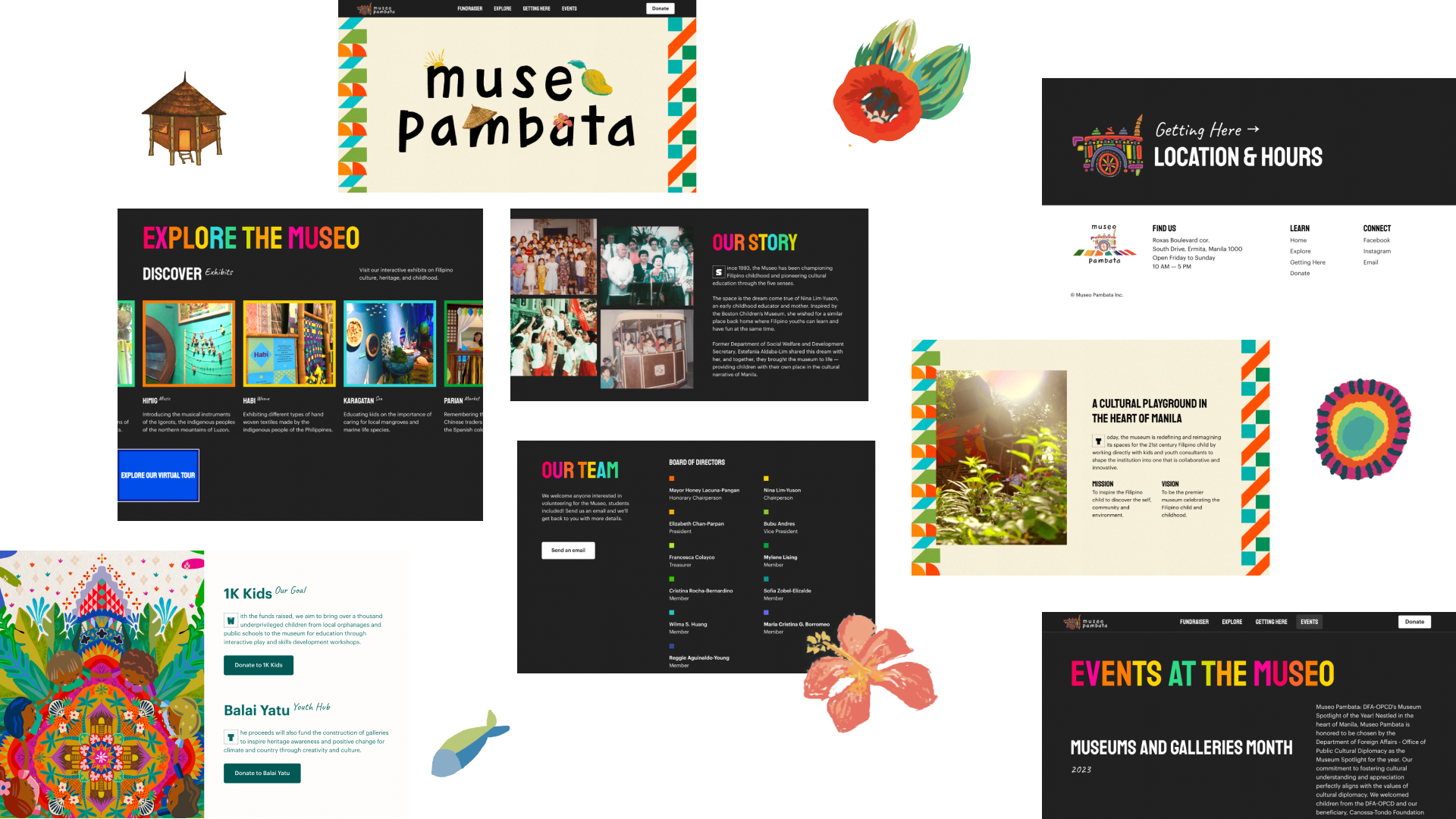
- The logotype with colorful illustrations in the hero section reflects a youthful energy
- The hand-drawn elements could be used as universal elements that tie the pages together
- The dark theme helps the content shine and emphasizes the bright colors of the logo and content, but what if it had a lighter theme?
- It seems to serve as an organizational profile than an institution that actively invites guests to visit and participate in their events.
- The events posted on their site are outdated, which is understandable because their patrons have more access to them on social media, so it makes sense to put more resources there.
- As an organization that accepts donations, it would be prudent to show transparency regarding how funds are used. A page for financial reports or documentation of past events could also be added.
Goal Setting
Okay, if I were to redesign this, what would be the goal?
To clarify the redesign goals, I have outlined some user stories from stakeholders:
- As a supporter of arts and culture, I want to donate to the museum.
- As a visitor, I want to prepare for my visit—know how to get there, ticket prices, and what to expect.
- As an events coordinator, I want to know how I can partner with the museum for activations.
- As an educator,I want to know how the museum can accommodate group tours.
- As a member of the board, I want to encourage more donations to sustain our initiatives.
- As the founder of the museum, I want my legacy honored on the website.
- As a donor, I want to know how my donations are used and receive recognition.
- As an individual who identifies with the museums' philosophy, I want to volunteer.
Strategy
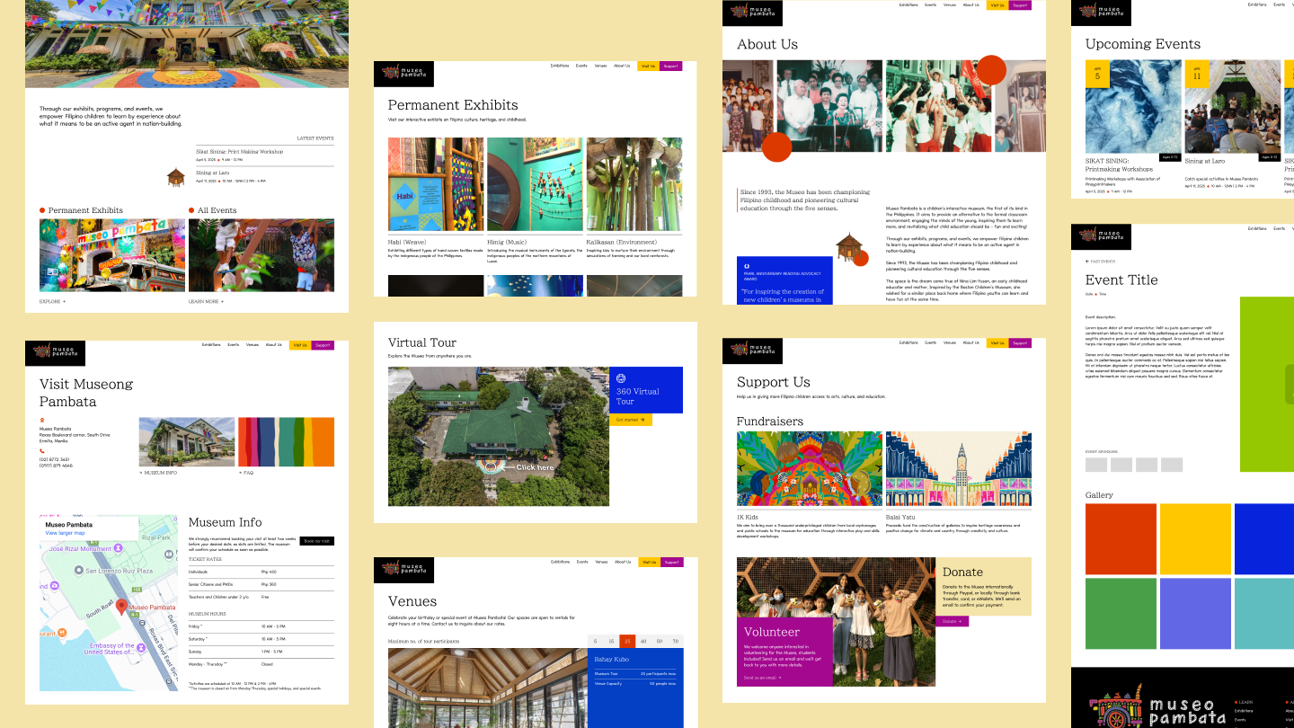
By restructuring the site's information architecture, I grouped content based on categories of action:

1. Learn about permanent exhibits
The museum features various interactive exhibits. To showcase the variety of experiences awaiting visitors, this page will include detailed information about each exhibit along with a dedicated section for the virtual tour.
2. Get updated about events
The events page will display current and upcoming events, inviting community participation. It will also serve as an archive for past events (including photos and event details) which can serve as post-event reports for donors, event partners, and followers.
3. Visiting the museum
This page will include essential information such as address, contact details, visitor guidelines, and FAQs to help patrons plan their trips.
4. Learn about the museum as an instiution
Highlighting its founding story, mission, vision, and team will allow visitors to connect with its cause—whether by visiting, donating, or volunteering.
5. Find information on supporting the museum's cause
Fundraisers and one-time donations will be consolidated on a support page offering donors options for allocating their contributions. A volunteer section will also be included.
6. Learn about the venue packages of the museum
Venue rental packages will be separated from exhibits to position them as distinct services—exhibits focus on individual visitors purchasing tickets at fixed prices, while venue rentals cater to larger groups with varying requirements.
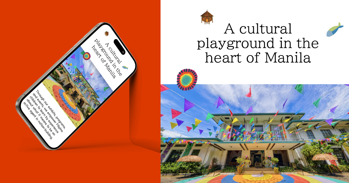
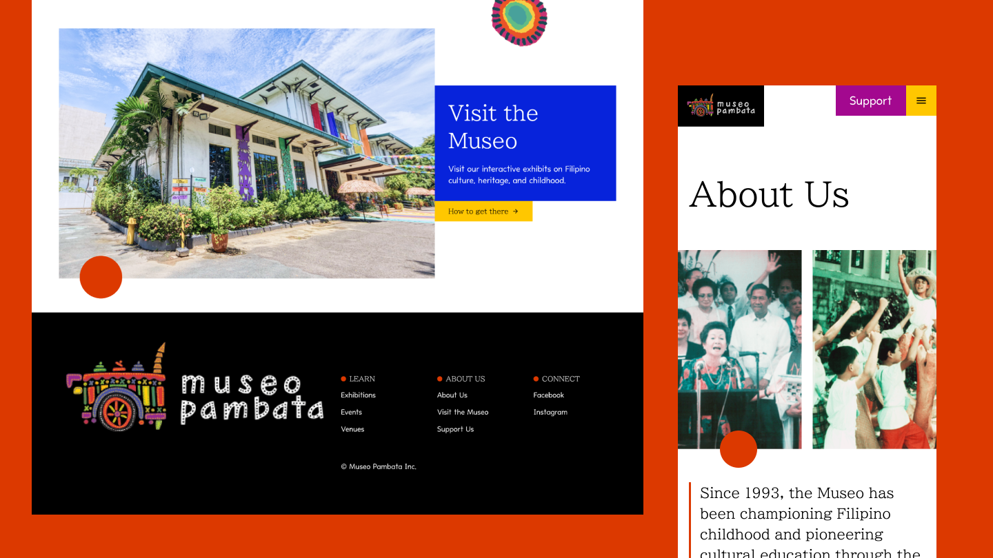
Design
For this redesign, I opted for a light theme while retaining the charming hand-drawn elements from the original site. These illustrations were complemented by bright geometric shapes used as UI elements like buttons and cards.
Overall, this redesign gives the site a vibrant appeal while improving discoverability of information to better support the goals of the museum's visitors.
Let's chat.
If these thoughts spark project ideas, counterpoints, feedback, or anything else, feel free to reach out.
